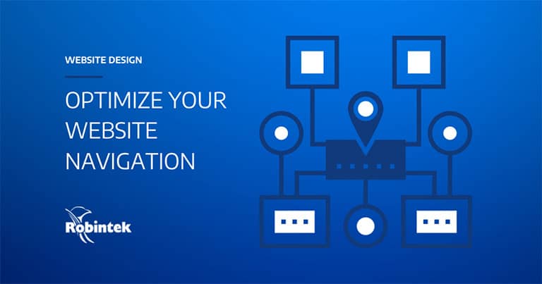
Your website navigation is one of the most critical elements of your site design. Your navigation or site menu is the way your visitors find the information they’re looking for. And usually, they want to find it fast.
With good navigation, your customers can find what they need quickly. Often, this means your visitors will stay longer on your site and become new or repeat customers.
But if your site navigation is disorganized, bloated, or otherwise ineffective, you will be more likely to experience higher bounce rates and lower conversions.
Not sure where to start? Here, we’ll give you 8 tips to help you design an optimized navigation experience on your website.
1. Create a well-organized sitemap
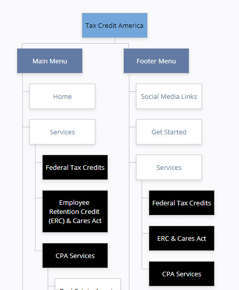
Whether you’re designing your website from scratch or rebuilding an existing site, creating a sitemap is essential.
A sitemap lays out all your website’s pages and how they relate to each other. This keeps your website content organized and efficient.
Otherwise, your navigation could become confusing for your visitor, or cause pages to get lost.
A sitemap tool like XML-Sitemaps or GlooMaps can help you structure your sitemap. Typically, you will want to keep the number of pages to a minimum while still including all the content you need to be successful.
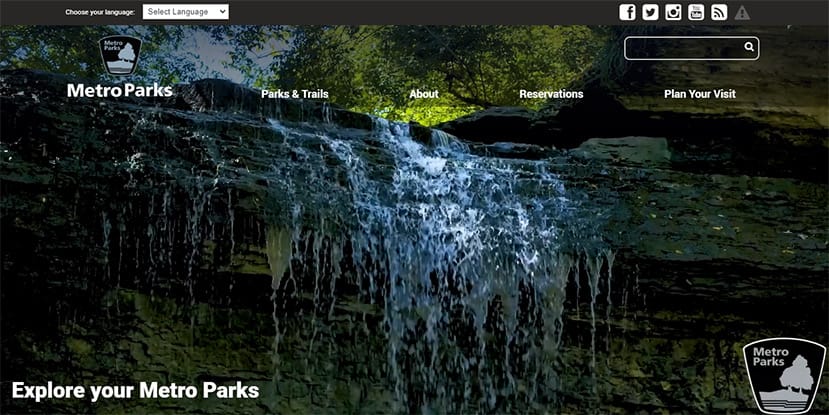
2. Keep your main menu simple
In general, your main site menu should be kept as clean as possible. The fewer clicks your visitors have to make to get the information they need, the better their experience will be.
Usually, the best spot to place your main menu is right at the top of the page. That’s where most users will look to find your navigation, so if it’s in an unusual place, they may not see it.
To keep your user experience simple and easy, ensure your pared-down menu is located at the top of the screen. On average, your main menu should include about 5-7 links, with dropdown menus incorporated as needed.
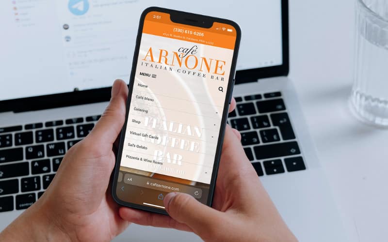
3. Use a mobile-responsive site menu
When you optimize your website for mobile, you typically simplify the layout and content of your site. This way, your website is easier to use on the go.
If the format or text is too small to read or click on, many users will abandon your website for something with a better user experience.
In addition to the layout and content, your site menu should be simplified for best usage on mobile devices.
A mobile-responsive design will automatically format your site and navigation to display optimally, no matter the device that’s being used.

4. Streamline your website’s pages
In most cases, simpler is better. That includes your design and content as well as your page count. Unless you are in a more technical or academic industry, you likely don’t need to overload your site with too many pages.
If you have lots of separate pages on your site, consider consolidating your content into fewer pages. Most visitors don’t have the patience to navigate through many different pages to find what they’re looking for, not to mention the content itself.
Combining pages is a good chance to review your existing content for opportunities to simplify or eliminate repetitive, outdated, or unnecessary text. Then, you can design your newly combine pages with a user-friendly format to keep your visitors engaged.
Use headings, subheadings, bullet points, and lists to help your visitors navigate through your content effectively.
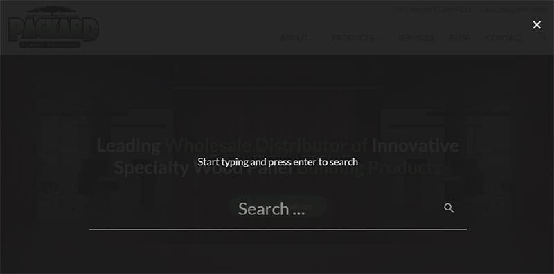
5. Add a search feature
Every good website should include a search function. Often, this will be located somewhere in the main menu as a magnifying glass icon.
By clicking on the icon, visitors can search your entire website for a specific keyword or phrase. This enables your users to find what they are looking for as quickly as possible.
The less time your user has to spend on your site to find what they need, the more positive their overall experience will be.

6. Include a call to action
To increase conversions, you can include a call to action (CTA) in or near your website’s main menu. Incorporating it into this important real estate helps your CTA to stand out on the page and stay visible.
But adding a CTA in this section will depend on best practices for your industry and the goals of your site.
For instance, in some cases, a link to your contact form or phone number is best. In others, you may want your CTA to encourage your visitors to download an informative, helpful resource like an e-book or case study.
Consulting with a professional can help you determine what type of CTA will work best for your menu.

7. Use categories on blog posts
Blogs can be great tools for adding engaging content to your website and improving SEO.
While you should post consistently to maintain the best online presence, adding new posts can add up to lots of additional pages on your site.
Most blogging platforms allow you to organize your posts into categories. Create and use different categories to describe the content of your posts.
This allows readers to click through to all the posts related to a specific topic. Again, fewer clicks and time spent searching for information will produce a more favorable experience for your user.
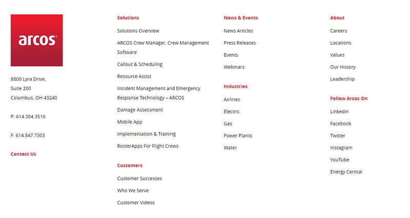
8. Utilize your footer
Just as all your visitors will look to the top of your site for your menu, they’ll also scroll to the bottom to find the footer.
The footer is commonly used to link to important pages on your site. Since users know to look here for links to what they need, including your most visited or updated pages here can save your user time.
Keep the footer links updated regularly and monitor for broken pages to prevent a poor site experience.

Navigation plays a major role in your site’s UX and SEO
Providing a good user experience not only keeps your visitors happy. It improves your SEO by demonstrating to Google and other search engines that your site is easy to use. This is one of the factors that play into your search engine rankings.
But when you’re trying to organize or combine lots of pages or create a new sitemap from scratch, deciding which pages should be linked where, and how, can be a challenge.
Enlisting a professional design company like Robintek to consult with you can provide you with useful recommendations for streamlining your navigation and enhancing your user experience.
Our team is always ready to help make suggestions or design your website navigation. Request a consultation to get started today.
Who We Are
We are Robintek, a web design company in Columbus, Ohio. From website navigation to graphic design to branding and identity, we can build a custom website tailored to your specific needs. With our web development, marketing, multimedia, and consulting services, we can be your all-encompassing resource for elevating your online presence.
For over 20 years, we have been helping more than 600 clients across the nation with services like logo design, content creation, SEO, eCommerce marketing and design, product photography, and much more. Ready to learn how Robintek can help grow your business? Reach out to us today!

