Spooky season is here, but don’t let your website scare away your customers.
Here are 10 common website mistakes that scare away potential customers and how to fix them.
1. Not mobile friendly
More people access the internet on their phones than any other device. In October of 2016 mobile surpassed desktop internet usage worldwide for the first time, and the percentage has only increased since then. If your site isn’t mobile friendly you are at a distinct disadvantage. If your site looks bad or performs poorly on mobile, you’re going to lose those potential customers.
How to fix it:
Update your website so it is responsive and mobile-friendly. A responsive website will display content differently depending on the device your site is viewed on. By changing the display based on device your website will be easy to read and navigate on a phone or any other device.
2. Slow site speed
Your website should load quickly. Most visitors will abandon your page if it takes any longer than a few seconds to load.
How to speed up your website:
A variety of factors can impact your site speed, from large photos and videos to problems with your code. To speed your site up you should first do a site speed web audit to find out what is slowing your site down. After the audit is complete take steps to fix those speed issues to speed your site up. These fixes could include optimizing your images for web, hosting videos on external platforms, minimizing HTTP requests, removing old or unused plugins, and more.
3. Dense text
People read differently online. Unlike with print, users tend to skim online content. They look for bolded words, headings, bullet points and other indictors of important information. People will skim content until they find what they’re looking for. This means that big, dense text blocks will lose readers attention. If visitors can’t skim online content, they’re more likely to leave your site.
How to fix it:
Use smaller blocks of text. Break up large sections of text into shorter, more scan-able bits. Use images and lists to add interest. Use subheadings and tables of contents to help your readers find what they’re looking for.
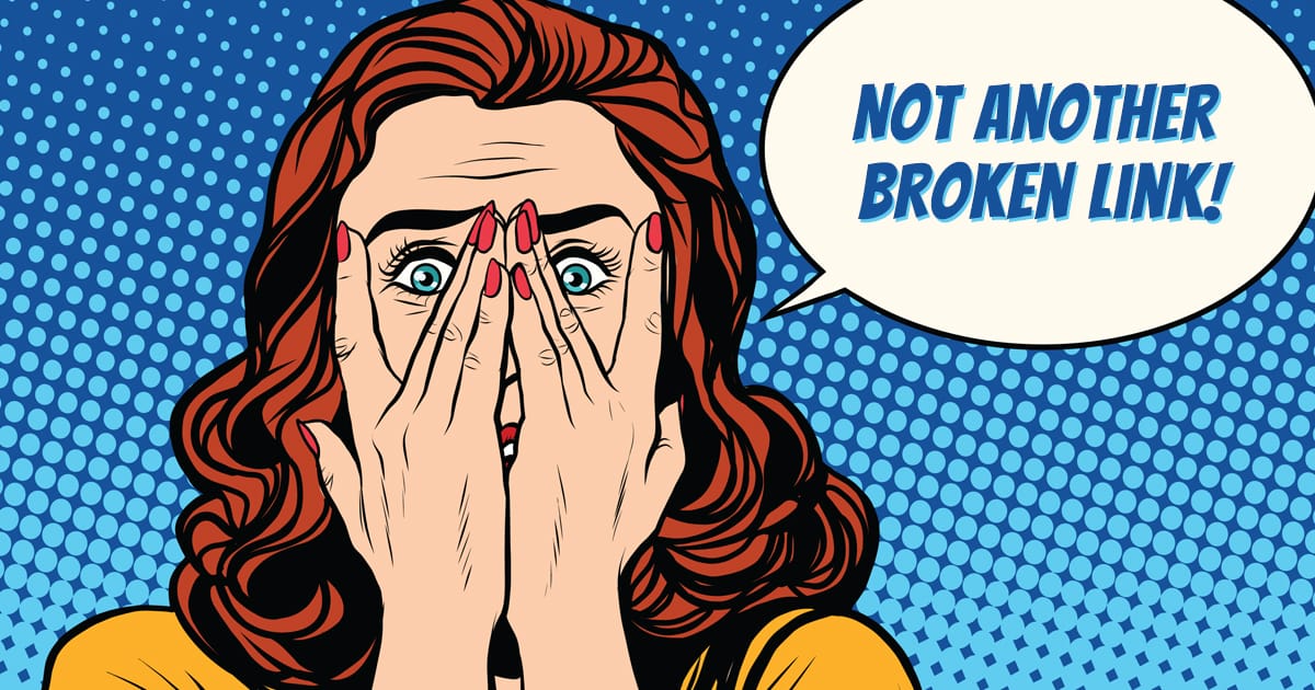
4. Broken links
Website visitors find broken links incredibly frustrating. When someone clicks a link and gets a 404 error the majority won’t go back and try to find the page they were looking for, they’ll just leave your site. This increases your bounce rate and lowers your conversion rate.
Broken links happen when the linked page is deleted or missing, when the destination page URL has changed but the link wasn’t updated, or if the URL of the link is wrong.
In addition to negatively affecting your user experience, bad links can damage your SEO.
How to Fix it:
Make finding and fixing broken links a priority in order to improve user experience, conversion rate, bounce rate, and SEO on your site. You can find and fix links manually or use an automated audit tool to identify broken links.
5. Hard to read text
Text readability is important for user experience and communication. If your site is difficult to read visitors are likely to leave rather than work to read your content.
There are a variety of design choices that can lead to text that is difficult to read. These include:
- Font size that is too small or too large
- Overly stylized text
- Poor color combinations
- Not enough contrast
- Overuse of text in all caps
Poor readability can make you lose potential customers. Make sure you use color combinations and font options that are easy to read so your message isn’t lost due to poor readability.
How to fix it:
Select fonts that are easy to read. Make sure that you use colors that help with overall readability.
6. Poor color contrast
Color choices on your website can affect overall user experience. Poor color contrast, either too much or not enough, can make your site difficult to read and navigate leading to higher bounce rates and lower conversions.
When choosing colors for your website be sure to keep users in mind. Design elements of your site should help, not hinder, communicating your message to visitors.
How to fix it:
Choose colors that complement your brand and benefit overall user experience. Make sure you check how colors appear on your site.
7. Hidden or missing contact information
In the real world, when a customer walks into a store and makes a purchase, they can see the person selling to them, and they know where the store is located and how to get in touch. These things build trust, helping customers make a purchase confidently.
Establishing trust online with your website is very similar. While there are a variety of ways to build trust with online customers, one of the easiest is to make sure your contact information is easy to find and use.
Listing your full contact information online lets visitors know that there is a real company behind your products and services. A prominent phone number let’s them know they can talk to a real person. A physical address lets them know where you’re located and if you’re local. An email address or a chat feature one your site shows that there are quick and easy ways to get in touch with you.
Making contact information easy to find builds customer trust, increasing the likelihood of them connecting with you or purchasing from you.
How to fix it:
Make sure you list all relevant contact information on your site and that it’s easy for visitors to find.
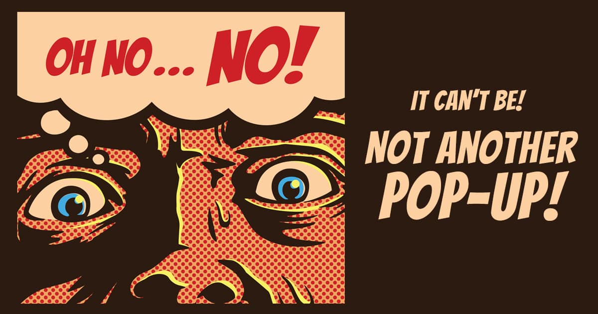
8. Poorly timed pop-ups
There are some effective ways to use pop-ups, however, it’s very easy for them to become obtrusive and annoying to your online visitors. Pop-ups are often a distraction to visitors from why they came to your site in the first place. They are often difficult to close or get past.
How to fix it:
Avoid using them unless absolutely necessary, and always keep user experience in mind if you’re including them.
9. Bad design
First impressions are important, and a poorly designed website gives a bad first impression. Whether your site looks dated or just unappealing, website visitors judge your company based on how your website looks. It’s important that your site appeals to your target audience so they feel confident in your ability to serve them.
How to fix it:
Make sure your website design looks good and reflects your brand. A professional website design can help your business make a good first impression.
10. Poor navigation
Visitors need clear, logical navigation to move around your site. If your links are confusing or difficult to use, rather than click around until they find what they need, visitors will likely just leave your site. Including a search as part of your navigation is also helpful so visitors have an easy way to find what they need if they’re not sure where to look.
How to fix it:
Organize your navigation logically, with user experience in mind. Make sure your menu items are brief and clear. If you need help reorganizing your sitemap to improve user experience, a professional site audit can help you better target your navigation to benefit your overall user experience and drive conversions.
Are these website mistakes a little too familiar?
If they are, your website could be scaring away visitors – and loosing you customers in the process!
Our team of experienced web designers and developers know how to help you connect with potential customers online. Want to make sure your website is working for you? Schedule a free consult with Robintek today.