3 Quick Tips to Improve Your LLM Visibility (And How Robintek Uses SEMrush to Make It Happen)
Written by Rod Vedder, Director of Client Relations and SEMrush Ambassador Large Language Models (LLMs)…
Rod VedderFebruary 24, 2026
 3 Quick Tips to Improve Your LLM Visibility (And How Robintek Uses SEMrush to Make It Happen)
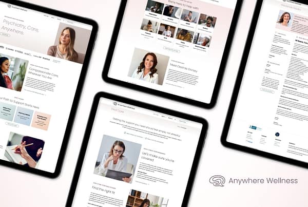 Anywhere Wellness Website & Branding Refresh
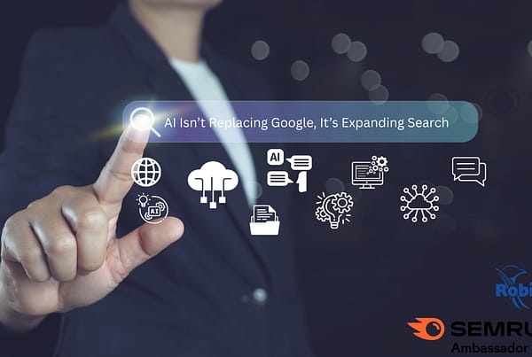 AI Isn’t Replacing Google, It’s Expanding Search. Here’s What That Means for Your Business.
© 2026 Robintek: Columbus Website Design, Graphic Design & SEO Company. Privacy Policy