How to make your website’s CTAs better
Converting visitors into customers is a huge priority for your website. Getting your call to action (CTA) right is key to transforming leads into conversions.
So, how do you optimize your CTAs? There are several factors that play into CTA performance including wording, styling, and location. While it’s not always possible to predict how a call to action will perform, there are some recommended best practices you can follow. These best practices will help you improve your CTAs to better engage your audience.
Be Specific
A good call to action tells users exactly what you want them to do. If you want people to take action, you need to tell them. If you want people to sign up for your newsletter, tell them. If you want them to download your whitepaper, clearly say download.
Be Bossy
Bluntly ordering people around probably isn’t going to make you a lot of friends in the real world, but when it comes to CTA’s straightforward, actionable text will win you conversions. You want your CTAs to scream “Do this now”. Your CTAs should begin with a verb (start, download, buy, etc.) to drive users to click.

Show Value
Users need a reason to click your CTA. Make sure to clearly state why they should.
Make it Personal
Use personal language in your CTAs to connect with your audience. This doesn’t mean using “click here [firstname]!” all over your site. Slight wording adjustments do make a difference with engagement though. Try to use first person, and use the data you have to tailor your CTAs to target to your audience. This could include location specific wording and language identifying current customers or new leads.

Create Urgency
Creating a sense of urgency for users is an effective way to engage users and boost your conversions. So, how do you create urgency with your CTAs? Using time-related language is one way to express a sense of urgency.
Things like “Shop Now”, “Donate today”, and “Get Started Now” are all good examples of using time-related language in CTAs. Another similar technique is using scarcity language. CTAs that use this method include words like “limited”, “last chance”, or “today only”.
Why does this work? People don’t want to feel like they’re missing out on something. CTAs with these types of messages urge users to complete the action to avoid that fear of missing out.
Make it Eye Catching
Your CTA should stand out. There are a variety of design tricks you can employ to do this including using bold or large text, contrasting colors, and eye-catching buttons. Don’t overdo it though. Simple and clean is sometimes the most effective option for making a call to action stand out.
Make it Easy
It shouldn’t be hard for users to take action on your website. Do everything you can to make conversions simple and easy on users so they have no reason to change their minds. From contact forms to signups and downloads ask for the minimum amount of information possible. People can lose interest easily so make it as simple as possible to interact with your site.
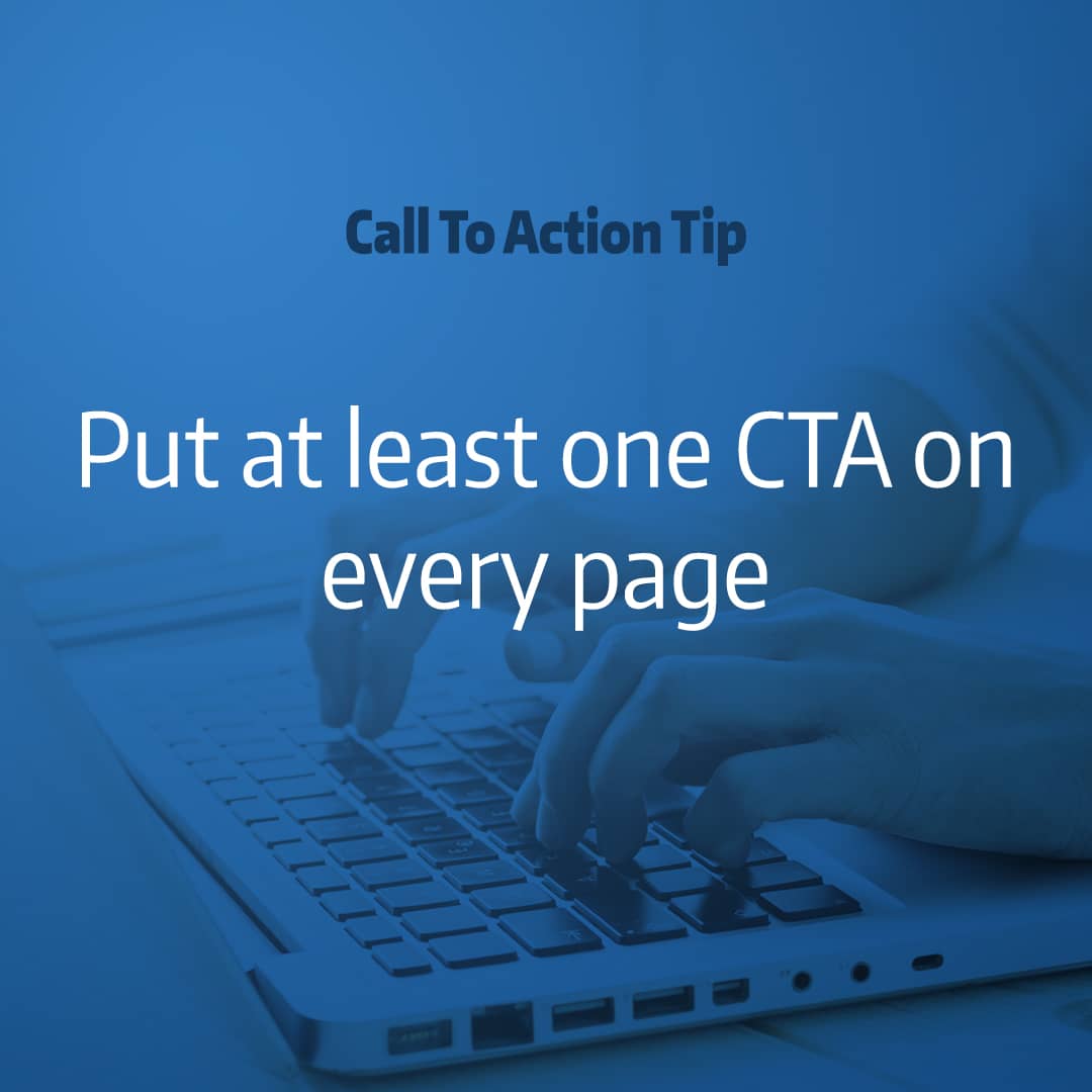
Put at least one CTA on every page
How many CTAs should you have on your website? It’s a good idea to have at least one per page so you’re consistently directing users through your website’s marketing funnels. Each page of your website should have an actionable purpose, something that tells your users “Do this next”.
Be strategic about your CTA placement
Beyond having at least one CTA per page, how do you know how many CTAs to use and where to put them on a page? A CTA should be the final push to get a user to take an action so placement should come after you’ve explained your offer or introduced your purpose.
You can use as many or as few CTAs as you need on a page- as long as each has a focus. Put yourself in your audience’s shoes. When do they need direction on what to do next on your site? CTA location should be logical and work with the flow of content on each page.
Get to the Point
Don’t be too wordy. A great CTA is clear and brief. CTAs that are long aren’t effective. Challenge yourself to get your point across in as few words as possible. Try to keep your CTA to four words or less.
Double check your links
Having a great CTA is meaningless if a user clicks and it leads to a broken page. After you’ve finished building a web page or creating an email double check that your calls to action are linking to the right page. There are tools to scan your website for broken links if you need to check all your CTAs. It’s a good idea to do a link audit on your website periodically to ensure none of your links are broken.
Track and Test
Make sure you tie your CTAs into your tracking analytics. Having the data to see what’s working and what isn’t is so valuable. By tracking and testing your calls to action you can better target your audience and drive conversions.
Key Takeaways
- Keep your CTAs short and action oriented
- Use personal language and create a sense of urgency to drive engagement
- Pay attention to styling and make sure CTAs are eye catching and easy to read
- Position CTAs at key points in your content, directing users through your site’s marketing funnels
- Track and test your CTAs performance and make changes as needed
Need help putting these best practices into action? Robintek can help you optimize your CTAs to better engage your audience.