At Robintek, we believe that every brand has a unique story to tell, and our recent collaboration with Beer Chugger, a brand dedicated to celebrating the joy of beer, is a testament to that belief. Beer Chugger came to us with a vision: they wanted a logo that would exude both fun and formality, reminiscent of a classic family crest but with a playful twist. Let’s take a closer look at how we brought their vision to life.
Understanding the Essence of Beer Chugger
Beer Chugger is all about camaraderie and the love of beer. Their product range includes everything from glasses and koozies to novelty items that capture the essence of beer-drinking moments. We knew that their logo had to reflect this spirit while adding a touch of vintage charm.
The Creative Journey: Our Logo Process with Beer Chugger
Our journey began with a comprehensive meeting with the Beer Chugger team to dive deep into their brand essence and the direction they wanted to take. They were inspired by vintage crests and intricate scrollwork, and this became our starting point.
We began crafting a variety of logo concepts, each drawing inspiration from vintage aesthetics and beer-related elements. Hops, beer steins, wheat, frothy beer, and glasses became integral components of our design arsenal. To further emphasize the beer theme, we explored various shapes, including those reminiscent of bottle caps and beer glasses. We also incorporated elements like crowns and formal scrollwork to capture the desired vintage feel.
Client Collaboration and Feedback
Our initial round of logo concepts sparked immense excitement within the Beer Chugger team. They were thrilled with the direction the project was taking. In fact, they were so enthusiastic that they decided to expand the project to include not only a primary logo but also two secondary emblems to support their brand and enhance their marketing materials.
The Results: A Primary Logo Design and Supporting Design Elements
Primary Logo Design
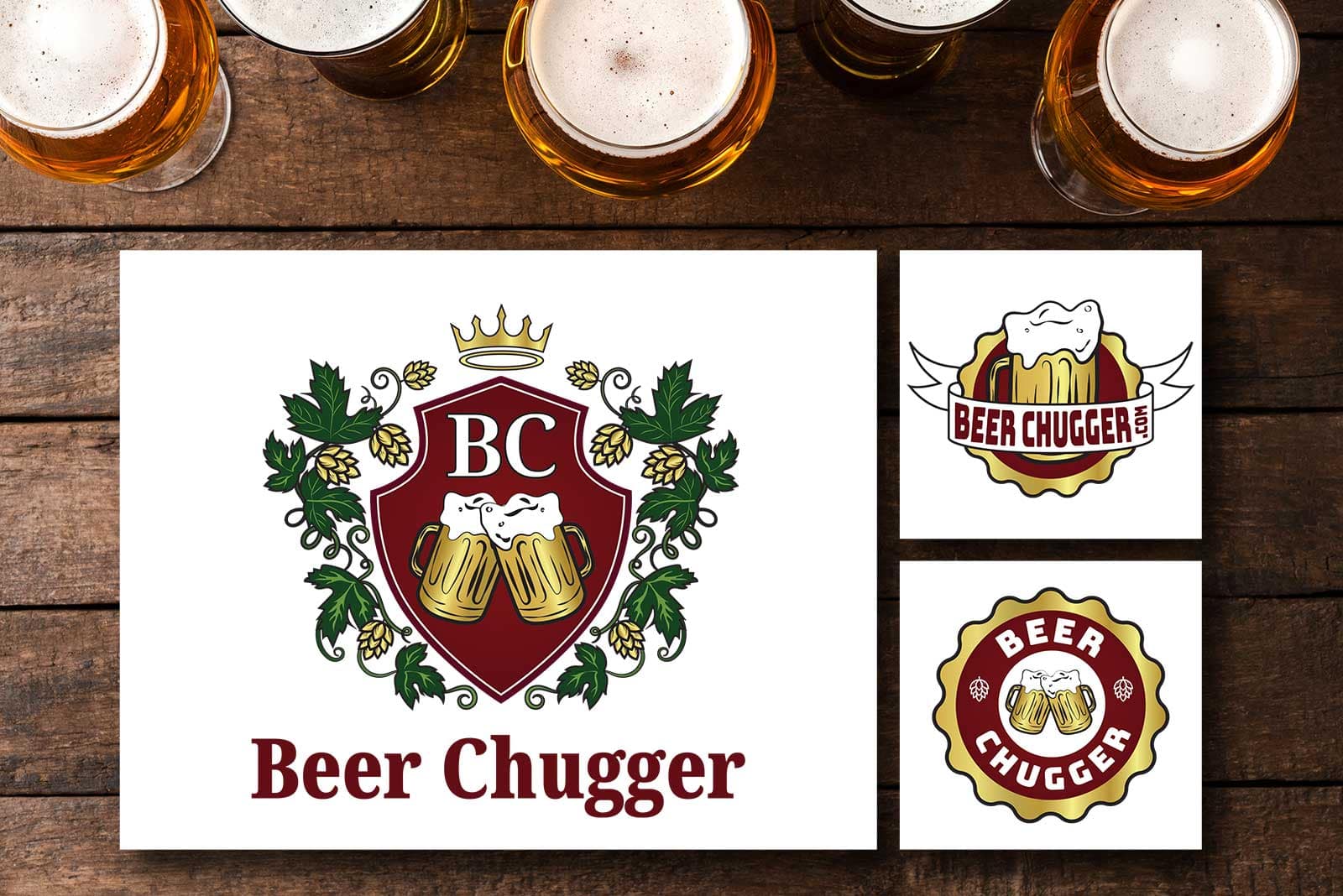
The primary logo design encapsulates the spirit of Beer Chugger. It features a shield-shaped crest surrounded by lush hops vines. At the top of the shield, you’ll find the initials “BC,” signifying Beer Chugger. Below this, two beer steins clink together, overflowing with foamy goodness, creating a vibrant and lively visual. A majestic crown sits atop the shield, adding an air of regality. This formal logo embodies vintage crest aesthetics and seamlessly weaves in beer-related elements. The color palette, with its rich maroon, elegant gold, and deep forest green, exudes the classic charm of royalty.
Secondary Emblems:
Secondary Banner Emblem: This circular emblem boasts a wavy edge, reminiscent of a beer cap. At its heart, a single beer stein overflows, a nod to the main logo. The brand name is elegantly displayed on a white banner, creating a harmonious visual connection with the primary logo.
Secondary Circular Emblem: Like the first emblem, this circular design takes inspiration from a beer cap. It cleverly incorporates both the clinking beer steins and hops illustrations from the primary logo. This emblem maintains the same color scheme as the main logo, simplifying it slightly to ensure visual cohesion across all brand elements.
A Successful Collaboration
In the end, the collaboration between Beer Chugger and Robintek resulted in a logo that seamlessly combines vintage charm with beer-loving camaraderie. It’s a crest that not only pays homage to the brand’s essence but also sets the stage for a beer-tastic journey.
Cheers to Beer Chugger, and here’s to celebrating the joy of beer, one logo at a time! If you’re ready to embark on a branding adventure of your own, reach out to us at Robintek, where we turn your vision into stunning reality.